As some of you know, it is my dream to work at the Sanrio Headquarters in San Francisco :) It might sound silly, but I can't completely explain or express my strong attraction for Sanrio design. Everytime I walk into the store, I want everything even if I dont need it. Why am I so deeply attracted to something that is so bluntly cute and happy? As I have been learning more about what is good design, I begin to question myself what exactly I love so much about Sanrio. I remember Lee saying that design that just looks nice is meaningless, design has to communicate something to the viewer. So in this blog I will try to explain what it is about Sanrio that captivates me.
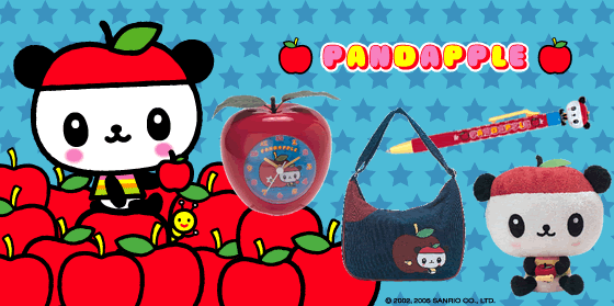
Where should I begin?? Well, first of all, like I said in my Qoo blog, "I really enjoy the playful and imaginative designs of this product. From the bright, bold colors to the thickness of lines, Qoo is a perfect balance between cute and sophisticated. At first glance, Qoo designs may seem childish, however, if you take time to explore their websites and look closely at their products, you will begin to notice the intricate details that make this product full of little surprises." This is the same way I feel about Sanrio, but Sanrio takes it to a whole other level. Sanrio consists of dozens of characters, each complete with their own name, biography, birthday, and family/friends (who also are named). For example, this is "Pandapple's" biography:

"Pandapple is a panda boy who loves apples! You will always find him wearing his trademark apple hat, he loves sitting on his favorite apple chair and he is very proud of his bright red apple house! Pandapple and his twin sister were born in Shanghai, China but he then moved to a big fruit farm in Southern California. Here he spends his time playing with his caterpillar best friend, Imomushi, munching away on yummy fresh apples and collecting all sorts of apple goods. Born on June 2, Pandapple is cheerful, sweet and sometimes a bit mischievious. His dream is to one day enter the Guiness Book of World Records for growing the biggest apple in the world! Pandapple - he’s cute to the core!"
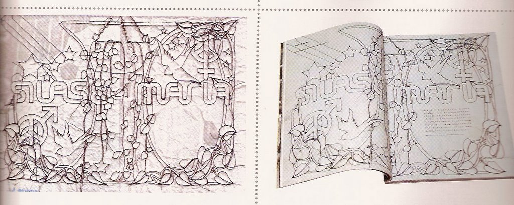
When I was in elementary school, I would always draw the Sanrio characters that liked. You would think that the simplicity of the Sanrio characters would be easy to replicate, and it is to an extent, but it is extremely difficult to capture the exact amount of cuteness that the Sanrio characters have. As a young child, I never really thought or cared about that, but in recent years I have realized that you can draw them over and over and never be able to quite get the same captivating effect of the Sanrio characters. Through looking really closely at Sanrio design and trying to reproduce their captivating effect, I think I might have an idea of what the secret is!! Its all about the proportions in the face. If the eyes are too close/far or too big/small, then it just won't work. With this in mind, I have been able to improve on my drawings and hopefully be on my way of perfecting the Sanrio effect in my own creations.
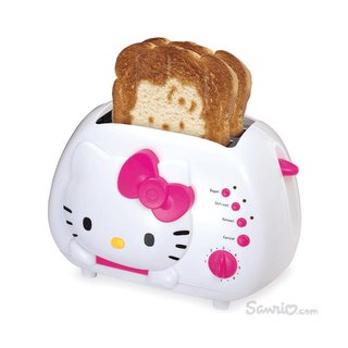
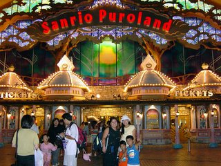
Another aspect to Sanrio that amazes me is their product lines. They have every product that you could possibly imagine, from stationary to toasters, surfboards, food products, clothing, digital cameras, fingernail clippers, hair flat irons, bed sheets, etc!! Each is designed specifically with the Sanrio style. In addition to this, their products are well made and actually function as sophisticated products for a mature consumer. Their wide variety of products makes Sanrio appropriate and attractive for a diverse audience. Also, Sanrio sells exclusve designs in their stores around the world. They have a Hawaiian line thats only sold in hawaii, a Japan line thats only sold in Japan, etc. Along with their enchanting design, they have an ingenious marketing strategy. They even have a Sanrio Land in Japan that is as equally elaborate and sensational as Disneyland.
Basically Sanrio has found a way to perfectly balance cute and sophisticated. Sanrio has become such a large and powerful company with such cute and passive "friends."


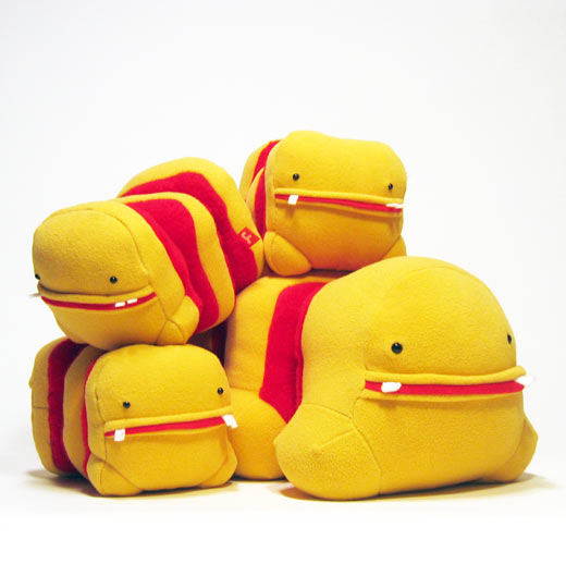
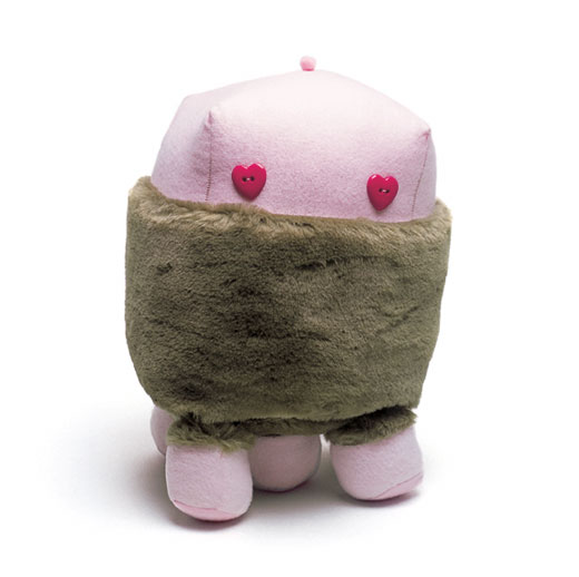

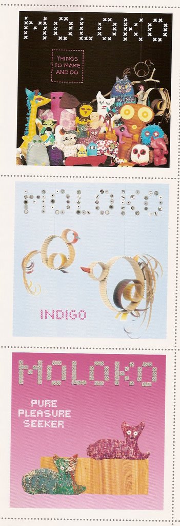
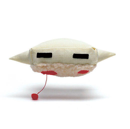 I really enjoy the imaginative style of the artwork in this website. It includes the artwork of various artists who all seem to be designing around the idea of childhood dreams and imagination, and how although they are filled with seemingly harmless and non-agressive images, there is a subtle underlying feeling of something disturbing or bizarre. I'm not sure if you get the same feeling, but it is kind of like the feeling you get when you look at little girls' dolls or when you go on a ride at Disneyland, such as "Peter Pan's Adventure" or "Alice in Wonderland," and you get kind of a creepy feeling. As a child, I never felt that creepy feeling, it was only when I got older that I began to look at these images differently. These artists are creating child-like materials for an adult audience. When you first look at their plush animals, books, short movies, etc, you automatically think that they are for a child audience, but then you look closer and realize that they do not all exactly function as children's toys, or at least not your typical child's toys. For example, one plush animal has unusually long arms, too long to be a cuddly child's stuffed animal, and another plush animal's feet are all attached by velcro so they can all be pulled off then put back on again. These artists are evoking an interesting feeling of "its so cute!!" (first thought), then "something about this seems very strange" (second thought).
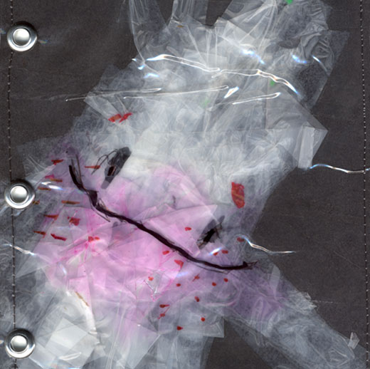
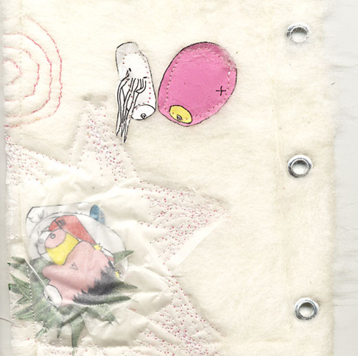 I found this book to be very interesting. As you see, the outside cover is a cute little baby, and inside the book are pages of seperate compositions of the babie's dreams. Some dreams are pleasant and serene, and others look like monsters. The all create a similar feeling to the one I described above.