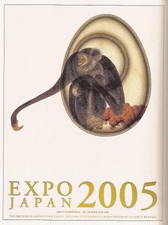
These series of designs were created by the Hara Design Institute and Nippon Design Center under the art direction of Kenya Hara. The client was "Expo 2005 Aichi," which is the Japanese branch of an annual world exposition that Japan participates in. The main theme of the 2005 World Expo was "Beyond Development: Rediscovering Nature's Wisdom."
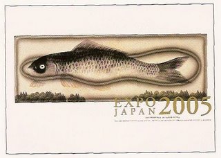

These posters were designed for an exhibition examining the ecology and the future relationship between humankind and nature. The design of these exhibition posters are really beautiful and elegant. The illustrations, which are the main focus, are large and powerful with their placement in an empty white space, yet they are not overpowering or too "in your face" because they are delicately drawn with tiny details, soft colors, and fine lines. The large images actually feel very subtle and non-threatening. The line, form, and color qualities really work together to convey a peaceful, harmonious relationship between humankind and nature.
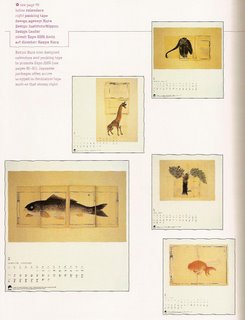
I really like the calendars that were designed for this expo. The combination of the simplicity of the lines, colors, and space on the paper, and the complexity of the illustrated nature forms, work together to communicate the balance of simplicity and complexity in nature. I also like the typography in the calendars; its detailed and elegant, but it doesn't overpower the delicateness of the images.

They even designed a packaging tape especially for this Japan expo. Like the other designs, this packaging tape also communicates complexity and simplicity. This packaging tape is an extra special touch to the whole design series for Expo 2005 Aichi.
 These series of designs were created by the Hara Design Institute and Nippon Design Center under the art direction of Kenya Hara. The client was "Expo 2005 Aichi," which is the Japanese branch of an annual world exposition that Japan participates in. The main theme of the 2005 World Expo was "Beyond Development: Rediscovering Nature's Wisdom."
 These posters were designed for an exhibition examining the ecology and the future relationship between humankind and nature. The design of these exhibition posters are really beautiful and elegant. The illustrations, which are the main focus, are large and powerful with their placement in an empty white space, yet they are not overpowering or too "in your face" because they are delicately drawn with tiny details, soft colors, and fine lines. The large images actually feel very subtle and non-threatening. The line, form, and color qualities really work together to convey a peaceful, harmonious relationship between humankind and nature.
  I really like the calendars that were designed for this expo. The combination of the simplicity of the lines, colors, and space on the paper, and the complexity of the illustrated nature forms, work together to communicate the balance of simplicity and complexity in nature. I also like the typography in the calendars; its detailed and elegant, but it doesn't overpower the delicateness of the images.
 They even designed a packaging tape especially for this Japan expo. Like the other designs, this packaging tape also communicates complexity and simplicity. This packaging tape is an extra special touch to the whole design series for Expo 2005 Aichi.

1 Comments:
I like the grouping of typographic information on the poster series it allows for space to open up and create a place for visual rest. Also the calenders allow for this to happen in the same way with the gestalt of information at very small point sizes. The packaging tape is interesting because of its functional quality.
Post a Comment
<< Home