Jonathan Barnbrook: Roppongi Hills typeface
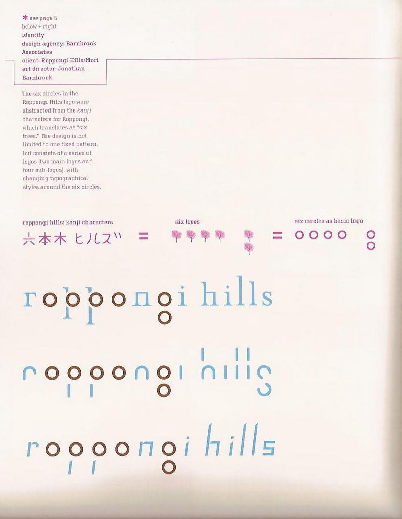
In typography 266, I had Jonathan Barnbrook's typface, Mason, as my subject for our typography poster project. Through researching about Jonathan Barnbrook's Mason typeface, I came across another typeface of his that really caught my interest. It looked strange and nothing like any typeface that I had seen before. I wasn't sure if i liked it or not, I just found it interesting. However, after looking more carefully at the typeface, I have come to really like it. It is the "Roppongi Hills" typeface which Jonathan Barnbrook created for the Roppongi Hills Company. Roppongi is a city in Japan that is infamous for its eccentric, bizarre, shocking styles and way of living. It is filled with prostitution, drugs, etc. It is known as the place where "all your fantasies come true." When I think of Roppongi, I think of a sleazy, dark underworld.
When I saw this "Roppongi Hills" typeface, I was surprised to see that a typeface for a company in Roppongi looked quite classy and clean with calm light blue and soft brown colors, yet it still gave a subtle feeling of something eccentric and never seen before. In this typeface, Jonathan Barnbrook demonstrates well that a classy and sophisticated typeface can be created for something that seems so unclassy and unsophisticated. The Roppongi Hills company has something to do with bringing in money to Roppongi through legal and professional methods, such as through tours and advertising their art museums and other attractions, so this typeface is perfect for their company.
Another layer to this typeface is the meaning behind the six circles that serve as the most dominant typographical element in this typeface. First of all, Roppongi is translated as "six trees." Then, in a traditional Japanese manner of creating letters/characters, the six trees are looked at literally and then transformed into symbols that represent the trees. Jonathan Barnbrook took these six "trees" and incorporated them into the type, and it fits perfectly! Then he created two main logos and four sub-logos around these six circles.
 These are banners that Jonathan Barnbrook created with the Roppongi Hills typeface.
posted by ashleep at 11:31 PM
![]()

2 Comments:
Wow this typography is really appealing to me because of the fact he designed it to be constructed from the idea of six trees. Each type family has a individual characteristic that sets it apart from the rest. The first from top to bottom is the serif type face that echoes its authority through its use of serifs. Secondly the the san serif type family
really takes use of its curves and terminals to create s's that descend the baseline that challenge convention that are set by academics and society. Thirdly the use of the right angles in the spine of the s's is really of interest for me because of the variations that are made from it. But over all the counters or the six circles as basic logos don't change at all. That idea of abstracting the the trees into circles really unites the family has a whole and works for a great recipe for design in typography.
When I first saw the typefaces in the first image you have up, i didn't quite agree that it was a successful typeface, but when i saw it applied on the banner, that demonstrated how it held together as a logo and identity piece. I agree with UnMi, the name Roppongi is perfect, and i do wonder how the whole identity of the company would have been different if there were not 6 rounded letters to use in it's existing name. I'm thinking they would extend the name of the company somehow to make it fit.
from the banners, i get almost a feeling of braile or morse code because of the small physically disconnected pieces that make up the whole, but there is visual continuity in the work because of the designer's success in creating the typeface in a way so that we as humans fill in the gaps in our mind and see the whole letter.
from the first image you have up of all the variations of the typeface, each one exudes a different feeling. the first one feels like his Mason typeface which keeps everything grounded on a single baseline, the second feels very playful but modern, and the third feels very digital-clock-like.
Post a Comment
<< Home