The Grand Hotel brochure
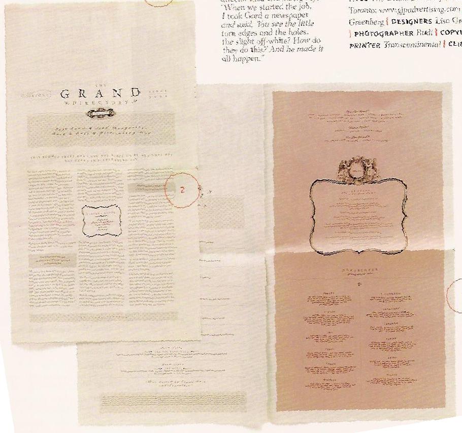
I found this interesting hotel brochure in the April 2006 HOW magazine. This brochure is entitled "The Grand Directory," and it was designed for a tiny hotel at the edge of Africa called "The Grand Hotel." It does not look like the typical hotel brochure, I didnt even know it was a brochure until I read the article about it. The cover looks like it could be a front page of a sophisticated newsletter and the inside pages look like they could be the pages of a menu for a high class restaurant. When Lisa Greenberg, the art director for this project, described The Grand Hotel she said, "If you can imagine, its a mix between a monastery and a brothel. It's like no other hotel, so we didn't want the brochure to be anything like those glossy, spot-varnished, high-end hotel brochures out there. This is a rare jewel of a place, ripe with character and truly original like the owner."
This brochure really captures the unique spirit of this "unusual getaway." First of all the designers chose to juxtapose elegant typography with newsprint. This entire brochure is printed on newsprint to create a welcoming, familiar feeling to the viewer. The typefaces that they chose to use were Mrs. Eaves, Dalliance, and Hoefler. The combination of these three typefaces create a sophisticated look "reminiscent of a lost era." As for the text, the cover consists of the story about the history of this hotel, which was created by Gail Behr who created this hotel in response to the loneliness he felt when checking into most hotels. The inside of the brochure consists of a "Grand Directory" in which they came up with a surprising way to give information about their accommodations through a horoscope section. They list the horoscopes and describe which of the hotel's eight rooms would be most suitable for a person depending on their horoscope. i thought this was such a creative and unexpecting way to present information.
posted by ashleep at 11:38 PM
![]()

2 Comments:
Well, its hard to see the scan that you elaborated on but through your description its brings it to life. I find that appropriation of material even for this circumstance usually offers positive results. I like the incorporation of newsprint to give a nostalgic feeling to the experience of a getaway.
there is a feeling of nostolgia that cannot be created with the typical gloss finish of most brochures, and i think that the designer made a wise choice in staying away from that. it really is an different approach to presenting the information through a horoscope type layout. but it really is nice to see that both the owner of the hotel and the designer really did have their hearts in the right place for this hotel. it is very obvious that both of them believe in art for art's sake, not for the commercial value. i agree with carley though, i really can't picture what a brothel and a monastery would look like, but it sure makes me curious!
Post a Comment
<< Home