Monday, March 20, 2006

Yoshitomo Nara


Yoshitomo Nara is one of my favorite artists. He is best known for his unusually cute childlike forms. Nara once said, "I want people to feel the commotion beneath the surface of my pictures." His artwork really comes alive, especially in his illustrations which display his spontaneous use of his materials, such as pen, colored pencil, crayon, and watercolor.

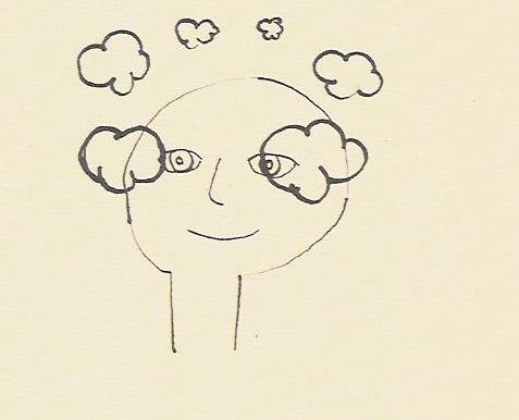
I am really attracted to Nara's unrestrained technique and simplicity of his forms and colors. Im especially attracted to his unique delicate sense of color, texture, and lines, which give his artwork a non-threatening, non-aggressive first impression, but as take a closer look, you see a darker, more serious side to the images.


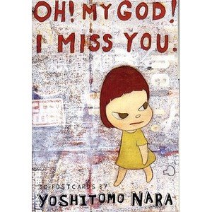
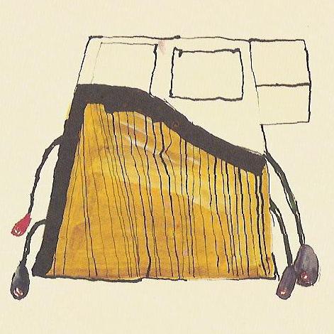
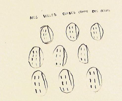
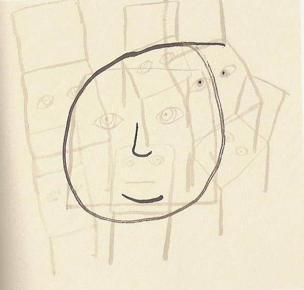
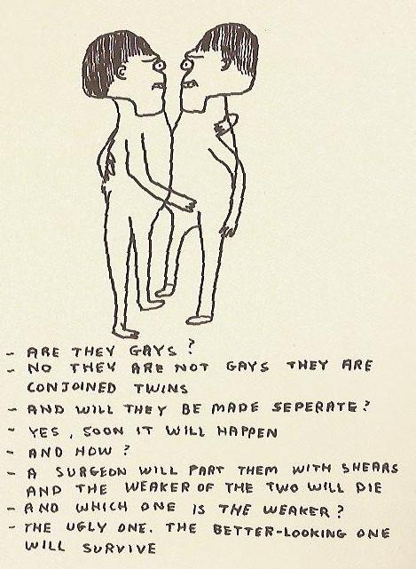
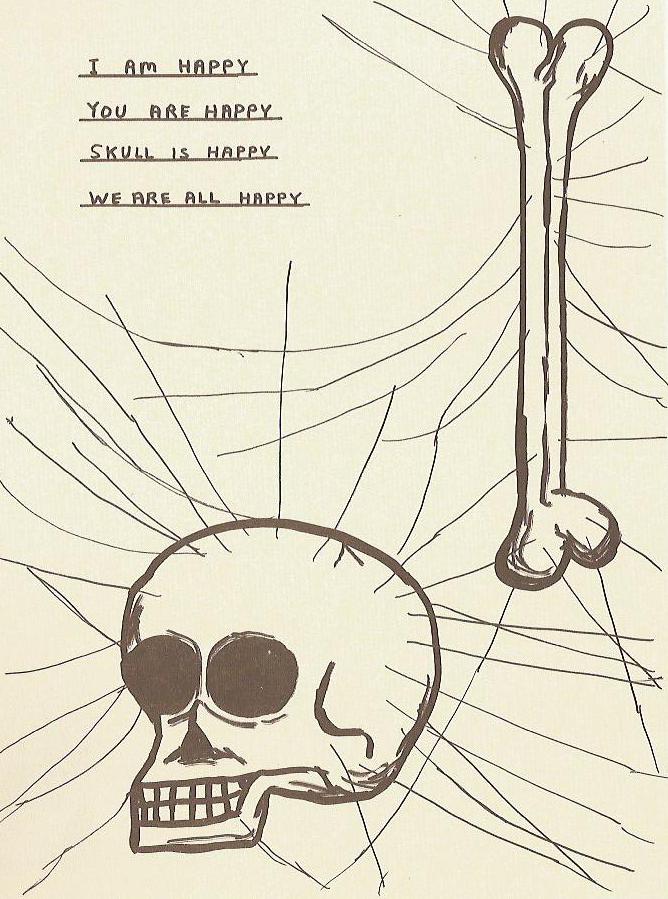
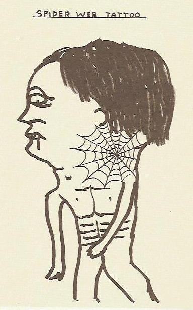
Yoshitomo Nara's art is often described as being in the style of "Hetauma," which is a graphic design trend translated as "Clumsy Skill." It refers to his "imperfect" forms and spontaneous use of lines, words and colors. Relating to graphic design, much of Nara's work includes text to convey a message. Nara's cute images, which often posess unexpected objects such as knives, matches, and cigarettes, include "scrawled exclamations" like "I'm Waiting Forever?" and "Fuck the Rotton World!" or more exclusive phrases such as "On the World in the Red Zone" and "Flying Nun." In some of his other drawings, empty cartoon bubbles suggest emotions that defy words. In these drawings, the narrowing of an eye, a tilted chin, or a curve of the lips can speak volumes instead. Yoshitomo Nara's artwork may seem cute and superficial at first, but you will soon discover the depth of emotions and important communication beneath the surface.

Monday, March 13, 2006

The Grand Hotel brochure


I found this interesting hotel brochure in the April 2006 HOW magazine. This brochure is entitled "The Grand Directory," and it was designed for a tiny hotel at the edge of Africa called "The Grand Hotel." It does not look like the typical hotel brochure, I didnt even know it was a brochure until I read the article about it. The cover looks like it could be a front page of a sophisticated newsletter and the inside pages look like they could be the pages of a menu for a high class restaurant. When Lisa Greenberg, the art director for this project, described The Grand Hotel she said, "If you can imagine, its a mix between a monastery and a brothel. It's like no other hotel, so we didn't want the brochure to be anything like those glossy, spot-varnished, high-end hotel brochures out there. This is a rare jewel of a place, ripe with character and truly original like the owner."

This brochure really captures the unique spirit of this "unusual getaway." First of all the designers chose to juxtapose elegant typography with newsprint. This entire brochure is printed on newsprint to create a welcoming, familiar feeling to the viewer. The typefaces that they chose to use were Mrs. Eaves, Dalliance, and Hoefler. The combination of these three typefaces create a sophisticated look "reminiscent of a lost era." As for the text, the cover consists of the story about the history of this hotel, which was created by Gail Behr who created this hotel in response to the loneliness he felt when checking into most hotels. The inside of the brochure consists of a "Grand Directory" in which they came up with a surprising way to give information about their accommodations through a horoscope section. They list the horoscopes and describe which of the hotel's eight rooms would be most suitable for a person depending on their horoscope. i thought this was such a creative and unexpecting way to present information.

Monday, March 06, 2006

What do you think??

I have recently been looking through some illustration books and there are some things that I find beautiful and fascinating, but there are some other things that I do not quite understand. Im sure that you have seen the type of drawings that look like it took a few seconds to draw or they look like a child could have drawn it. They consist of simplistic lines and shapes, awkward and imperfect forms, and a quick doodling quality. I find some of these sort of drawings to be interesting, but there are some that are just beyond me. What makes these drawings so great?? Anyone could have drawn these.

I found these images in a book called Vitamin D: New Perspectives in Drawing, which is a well-respected art book, so I question why some artwork was important enough to be put into this book. These first set of drawings are done my Anne-Marie Schneider. I was attracted to some of her drawings, such as the top image (Untitled) because of its mysterious form and swashes of color, and the middle image entitled "Nos villes closes comme des oeufs (Our cities are as Closed as Eggs)" because of its simplistic way of making a statement. However, I am not too sure of the importance in the third and forth images. Where is the line drawn between "good" art and images that are just ridiculous? Anne-Marie Schneider says that drawing for her is like writing a journal entry everyday. She says, "It keeps me from writing only with words; these are daily images." But even with this said, I am still unsure as to the significance of the third and forth images.


The second set of images, which are also from the Vitamin D book, are done by David Shrigley. His artwork is described to have a "seemingly childlike, "artless" style. I was immediately attracted to some of his drawings such as the first and second images but Im not too sure why I find them interesting. Maybe because of his unusual human forms and imaginative quality. However, I question the significance of the third and forth images. Shrigley says, "I deliberately try to make my work as intuitive as possible, so in a sense it's about everything and nothing."

I think people may be attracted to this type of art because it is very imaginative. They are drawings that the artist first visualizes in their minds, then lets the image from their mind flow out of their hand through a pencil and on to paper. Thats why the images often seem distorted, bizarre, abstract, which makes them interesting. HOWEVER, Im still confused on some images like the ones i mentioned above. What do you think?