Lizzie Finn (Area, pgs 112-115)
Most designers today, including Lizzie Finn, do not work without a computer. However, the computer is one of the last tools that Lizzie Finn uses in her process of designing. She always begins with pencil and paper, then she moves on to using needle, thread, and sewing machine to incorporate her love for traditional household crafts. She has always had a passion for sewing, but she was "further inspired by 1970s feminists who adopted domestic stitching in their protest signs for equal rights."

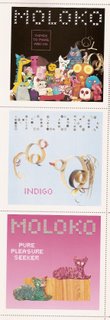
In 2000, Finn designed a CD cover for a British band called Moloko (the first square is the CD cover that I am talking about, the other two are CD covers for promotional singles). The cover portrayed a colorful bunch of hand stitched animal rag dolls. The title was "Things to Make and Do." The band loved Finn's surprisingly appealing design and title. Inside the CD booklet, Finn included instructions for making your own hand stitched rag doll. These simple do-it-yourself instructions added a special touch to the presentation of the CD. It created another level of interaction between the viewer and the artist. It also created another purpose for this product; it not only provides you music from the musical artist, it also provides you with a surprising interaction with the graphic artist. "Things to make and do" became Finn's working philosophy.

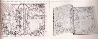
I also found this second piece to be interesting. It is a magazine spread that she designed for a UK fashion brand. On the left, Finn's original artwork for this piece is depicted. It shows a wrinkled piece of cloth or paper with text and images that are stitched on it with black thread. Her sewing technique adds a unique quality to the design and is appropriate for the attitude of the company. If the same had been done on a computer, the whole feeling would have been completely different, and probably not as appropriate/effective. The actual magazine spread is depicted on the right. Although it is not the original, the qualities and texture of the original stitched piece still carries through.
Lizzie Finn's artwork reminds us that there is so much more to design than what we can do on the computer. The computer is an extremely valuable and important tool, but we should not rely on it completely. In our high-technology world today we tend to overlook the possibilities of using non-technology techniques in our design processes, but we need to remember that although the computer seems to enable us to do "everything" and "anything," some things just can't be done on the computer and can only be achieved through traditional techniques.

In 2000, Finn designed a CD cover for a British band called Moloko (the first square is the CD cover that I am talking about, the other two are CD covers for promotional singles). The cover portrayed a colorful bunch of hand stitched animal rag dolls. The title was "Things to Make and Do." The band loved Finn's surprisingly appealing design and title. Inside the CD booklet, Finn included instructions for making your own hand stitched rag doll. These simple do-it-yourself instructions added a special touch to the presentation of the CD. It created another level of interaction between the viewer and the artist. It also created another purpose for this product; it not only provides you music from the musical artist, it also provides you with a surprising interaction with the graphic artist. "Things to make and do" became Finn's working philosophy.

I also found this second piece to be interesting. It is a magazine spread that she designed for a UK fashion brand. On the left, Finn's original artwork for this piece is depicted. It shows a wrinkled piece of cloth or paper with text and images that are stitched on it with black thread. Her sewing technique adds a unique quality to the design and is appropriate for the attitude of the company. If the same had been done on a computer, the whole feeling would have been completely different, and probably not as appropriate/effective. The actual magazine spread is depicted on the right. Although it is not the original, the qualities and texture of the original stitched piece still carries through.
Lizzie Finn's artwork reminds us that there is so much more to design than what we can do on the computer. The computer is an extremely valuable and important tool, but we should not rely on it completely. In our high-technology world today we tend to overlook the possibilities of using non-technology techniques in our design processes, but we need to remember that although the computer seems to enable us to do "everything" and "anything," some things just can't be done on the computer and can only be achieved through traditional techniques.

2 Comments:
wow, that is a very interesting album cover/packaging design. i am personally very interested in packaging, and i have just purchased a couple of cd and dvd art books. in them are all kinds of designs for cd and dvd packaging, but i don't think i've come across something like finn's yet. i think that is really smart to have a second layer of use for the package, it really does engage the audience in taking a step closer to the band.
for the second design, there is a very textural feeling that comes across and that is definately not totally reproducable with a computer. there really is a tactile essence with finn's design which i am very attracted to. the design we see is primarily two dimensional, and we are simply impressed with what is printed, but to employ a second sense in the design experience is a great undertaking that takes a greater sensitivity towards the entire design piece
I like the idea of traditional ideas being communicated digitally. Especially, the stitching in this case which has a great tactile affect and communicates a feeling of human interaction.
Human interaction that people seek and try to find visually in design, so in that respect we should have our hands in the process at all times. Process that we as designers are always trying to find away to visually communicate through trial and error.
Being resourceful I feel is ideal way to be when your in the design process. Because every thing around has the potential of being a element if it fits in you concept or it might just spawn a idea and help in your conception.
Post a Comment
<< Home