Tuesday, May 02, 2006

Aqui Uzumaki

** watch this video from the show **
http://www.friendswithyou.com/gallery2/aquiuzumaki.html
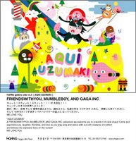


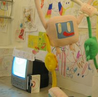
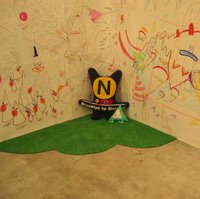
This is an art show that was done by a collaboration of artists from Friendswithyou, Mumbleboy, and Gaga Inc. "Aqui" is a Spanish word that translates as "here" and "Uzumaki" is a japanese word that translates as "the Vortex." This show creates an imaginary world, its like walking into a two-year-old's imagination, that is filled with bright colors, crayon drawings, playful music, and unusual creatures all swarming around together.

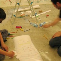
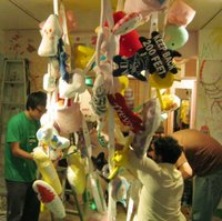
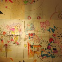
The process of creating this show is what really interested me. They sat on the ground and used crayons, pens, color pencils to draw on pieces of paper to be pasted on the walls, or they just drew directly onto the walls. The plush animals are hand sewn so there are no two alike. Some of the plush animals were directly drawn on with pens. The whole process is very hands on.

I would have loved to walk into this room. You can really sense the energy and passion that went into the creation. It is like walking into a vortex that immediately sucks you into a different world at the moment that you walk through the entrance. You become mesmerized by this other world; getting lost in the drawings on the walls, walking pass white tree branches with imaginary creatures hanging from them, listening to the music. ...i wish i could have been there......

Monday, April 24, 2006

Brian Andreas

Brian Andreas is an illustrator, fiber artist, sculptor, and story teller. He uses traditional media from the fine arts, theater, and storytelling, as well as electronic media, to explore new ways of being an artist. He also likes to "put things together with the rustiest stuff he can find." In his sculptures, he uses only recycled materials, such as scrap wood, scraps of barn tin and wire, etc.

I was attracted to a book that he wrote and illustrated entitled "Trusting Soul." This book is about moments or lessons in life that we experience, but don't really think about. The content is simple enough for a child to read and enjoy, but it is also mature enough for an adult audience to appreciate. The illustrations look like they were drawn by a child. His forms are very imaginative, and they suggest just enough information so that the audience can understand what the image is conveying while still leaving room for the audience to interpret it in their own way. I also like the two different kinds of type that he used. The childish hand drawn type that goes with his illustrations really help to narrate the drawings, and the main type nicely contrasts with the hand drawn type to set the different stories apart. The main type is all hand-stamped one letter at a time!


Monday, April 17, 2006

Nagi Noda (revisited): "Sentimental Journey"


*watch the music video!!!
http://www.dandad.org/awards2005/qt.asp?entry_id=V_11442&f=000L&title=Sentimental%20Journey

This is a poster that Nagi Noda created for a music album by a popular japanese singer named Yuki. The music album is entitled "Commune" and the featured song is entitled "Sentimental Journey." This music poster is a photograph of the music video that was done for the "Sentimental Journey" song. This song sums up the concept of the music album which is about her interpretation about the "sentimental journey" of the changes that one goes through in life. She is inhabiting a surreal world in which she is dancing, jumping over a puddle, falling, passing by a golfer, eating an apple, watching someone die, then that person's spirit rises from their body and goes to the after-life world, while Yuki changes clothes and exits the house as a changed person.

This piece of artwork effectively serves individually as both a photograph and a music video. It is such a beautiful, creative, unusual way to represent one's journey through changes in life. Did you notice that the entire photograph/video takes place in a single curved-wall room with painted walls? The paintings on the walls of the buildings, landscape and sky along with the carefully changing ground are so well crafted that the viewer's eyes just flow through her journey seamlessly. Also, each figure is a different girl that is posing very still. The music video/photograph begins with Yuki in the pink dress, and then similar looking girls form her multiplied self thoughout the scenes. Even the golfer is made up of five different men. In order to make it look like Yuki is jumping in the air, the girls are attached to clear strings to hold them up off the ground. And in order to make it look like her dress or hair is blowing in the wind, they stiffened the girl's hair/dress in that position to make it look like each figure is frozen in time. There are no camera tricks, so if you look closely when you watch the video, you can see the girls blinking their eyes or slightly moving.

**watch some of her other videos!!!

1. Gekkeikan Sake: (Hanpanda Commercial)
http://www.partizan.com/partizan/directors/video.php?id=408

2. Laforet: "The Ribbon"
http://www.partizan.com/partizan/directors/video.php?id=409

3. Mariko Takahashi: "Ex-Fat Girl"
http://www.partizan.com/partizan/directors/video.php?id=376

4. Ogiyahgi: "Must Be"
http://www.partizan.com/partizan/directors/video.php?id=407

Tuesday, April 11, 2006

Expo 2005 Aichi

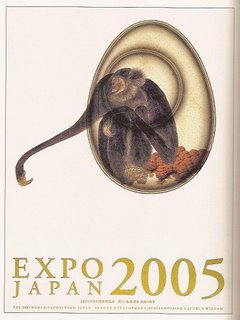
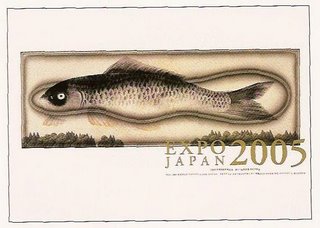
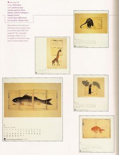
These series of designs were created by the Hara Design Institute and Nippon Design Center under the art direction of Kenya Hara. The client was "Expo 2005 Aichi," which is the Japanese branch of an annual world exposition that Japan participates in. The main theme of the 2005 World Expo was "Beyond Development: Rediscovering Nature's Wisdom."

These posters were designed for an exhibition examining the ecology and the future relationship between humankind and nature. The design of these exhibition posters are really beautiful and elegant. The illustrations, which are the main focus, are large and powerful with their placement in an empty white space, yet they are not overpowering or too "in your face" because they are delicately drawn with tiny details, soft colors, and fine lines. The large images actually feel very subtle and non-threatening. The line, form, and color qualities really work together to convey a peaceful, harmonious relationship between humankind and nature.

I really like the calendars that were designed for this expo. The combination of the simplicity of the lines, colors, and space on the paper, and the complexity of the illustrated nature forms, work together to communicate the balance of simplicity and complexity in nature. I also like the typography in the calendars; its detailed and elegant, but it doesn't overpower the delicateness of the images.

They even designed a packaging tape especially for this Japan expo. Like the other designs, this packaging tape also communicates complexity and simplicity. This packaging tape is an extra special touch to the whole design series for Expo 2005 Aichi.

Tuesday, April 04, 2006

Nagi Noda

Nagi Noda is a artist/designer/director from Japan. Her world of creativity is both whimsical and strange. Her work "offers a twist" on the Japanese fascination with "kawaii," or cuteness. Nagi Noda says, "A lot of people call my work 'kowa kawaii.' It means cute, but a little bit weird. But I can make lots of styles: kowa kawaii, just kawaii, beautiful kawaii, fashion kawaii..." Among other things, Nagi Noda has designed stuffed animals, book jackets, and shopping bags. She is known for her line of half-panda creatures, called Hanpanda. Hanpanda is so cute!! but when several life-size Hanpandas are dancing around with eachother in a sake (japanese alcohol) commercial, these extremely cute Hanpandas create an unusual disturbing atmosphere.


Through her own company, Uchu Country, she has directed short films and commercials for companies such as Nike and Laforet. the "fashion-forward" shopping mall in Japan's Harajuku district. I found her work for Laforet to be really interesting. In these sequence of posters, Noda gives the viewer a glimpse into bizarre and otherworldly scenarios. These posters immediately capture my attention, and their strange, open-ended scenes, draw the viewer in to get lost in both Nagi Noda's and your own imagination.

I also found her exercise video piece to be interesting. It consists of poodles doing aerobics led by a poodle-like human instructor. At first glance, the video just seems to be a poor attempt to create a fun exercise video for children, but then you take a second look and you see that the lady instructor has bulges under her skin on her arms and legs which match the bulges of hair on the poodles. Im not sure if it holds any deep meaning, but it sure entertains my mind and its really funny in an unusual way.

The concepts and humor in Nagi Noda's works are a mixture of the simplicity and innocence that we had when we were kids, and the darkness and maturity of the adult world. Her work is described as "fresh and unexpected, and her execution is organic, which makes it more emotional. She doesn't rely on heavy post effects to get her point across."

Monday, March 20, 2006

Yoshitomo Nara


Yoshitomo Nara is one of my favorite artists. He is best known for his unusually cute childlike forms. Nara once said, "I want people to feel the commotion beneath the surface of my pictures." His artwork really comes alive, especially in his illustrations which display his spontaneous use of his materials, such as pen, colored pencil, crayon, and watercolor.

I am really attracted to Nara's unrestrained technique and simplicity of his forms and colors. Im especially attracted to his unique delicate sense of color, texture, and lines, which give his artwork a non-threatening, non-aggressive first impression, but as take a closer look, you see a darker, more serious side to the images.


Yoshitomo Nara's art is often described as being in the style of "Hetauma," which is a graphic design trend translated as "Clumsy Skill." It refers to his "imperfect" forms and spontaneous use of lines, words and colors. Relating to graphic design, much of Nara's work includes text to convey a message. Nara's cute images, which often posess unexpected objects such as knives, matches, and cigarettes, include "scrawled exclamations" like "I'm Waiting Forever?" and "Fuck the Rotton World!" or more exclusive phrases such as "On the World in the Red Zone" and "Flying Nun." In some of his other drawings, empty cartoon bubbles suggest emotions that defy words. In these drawings, the narrowing of an eye, a tilted chin, or a curve of the lips can speak volumes instead. Yoshitomo Nara's artwork may seem cute and superficial at first, but you will soon discover the depth of emotions and important communication beneath the surface.

Monday, March 13, 2006

The Grand Hotel brochure


I found this interesting hotel brochure in the April 2006 HOW magazine. This brochure is entitled "The Grand Directory," and it was designed for a tiny hotel at the edge of Africa called "The Grand Hotel." It does not look like the typical hotel brochure, I didnt even know it was a brochure until I read the article about it. The cover looks like it could be a front page of a sophisticated newsletter and the inside pages look like they could be the pages of a menu for a high class restaurant. When Lisa Greenberg, the art director for this project, described The Grand Hotel she said, "If you can imagine, its a mix between a monastery and a brothel. It's like no other hotel, so we didn't want the brochure to be anything like those glossy, spot-varnished, high-end hotel brochures out there. This is a rare jewel of a place, ripe with character and truly original like the owner."

This brochure really captures the unique spirit of this "unusual getaway." First of all the designers chose to juxtapose elegant typography with newsprint. This entire brochure is printed on newsprint to create a welcoming, familiar feeling to the viewer. The typefaces that they chose to use were Mrs. Eaves, Dalliance, and Hoefler. The combination of these three typefaces create a sophisticated look "reminiscent of a lost era." As for the text, the cover consists of the story about the history of this hotel, which was created by Gail Behr who created this hotel in response to the loneliness he felt when checking into most hotels. The inside of the brochure consists of a "Grand Directory" in which they came up with a surprising way to give information about their accommodations through a horoscope section. They list the horoscopes and describe which of the hotel's eight rooms would be most suitable for a person depending on their horoscope. i thought this was such a creative and unexpecting way to present information.